The Power of Infographics: How Visual Models Turn Real Estate Data Into Decisions
Learn about the power of using infographics in your marketing.
Tags
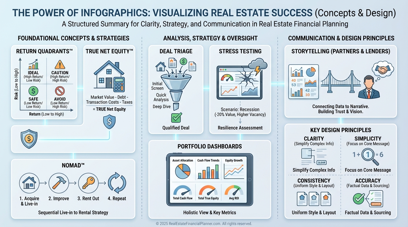
Why Infographics Matter in Real Estate Analysis
Numbers tell the truth, but visuals make the truth unavoidable.
When I help clients decide whether to buy, sell, or hold, a single well-constructed graphic often creates more clarity than ten spreadsheet tabs.
I model outcomes for multiple loans, rents, and timelines, then compress the results into visuals that answer one question at a time.
That discipline prevents decision fatigue and reduces expensive mistakes.
Turning Spreadsheets Into Strategy
Most investors drown in data because everything looks equally important on a grid.
Infographics force prioritization, showing the one lever that moves results most.
Then we act.
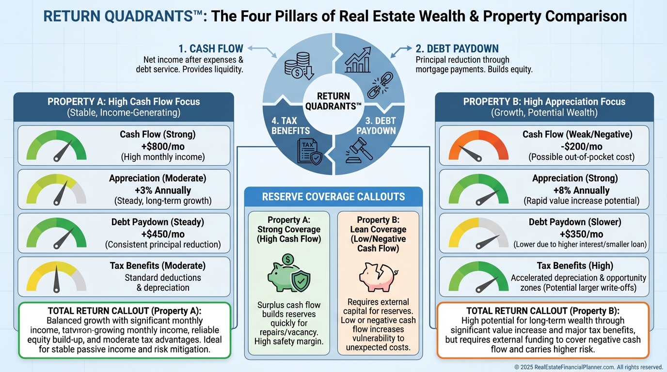
Visualizing the Return Quadrants™
Cash flow is only one part of your return.
I teach clients to read all four Return Quadrants™—Cash Flow, Appreciation, Debt Paydown, and Tax Benefits—plus Reserves to understand risk.
One picture comparing quadrants for two properties usually reveals the winner in seconds.
It also prevents chasing high cash-on-cash while ignoring lopsided risk.
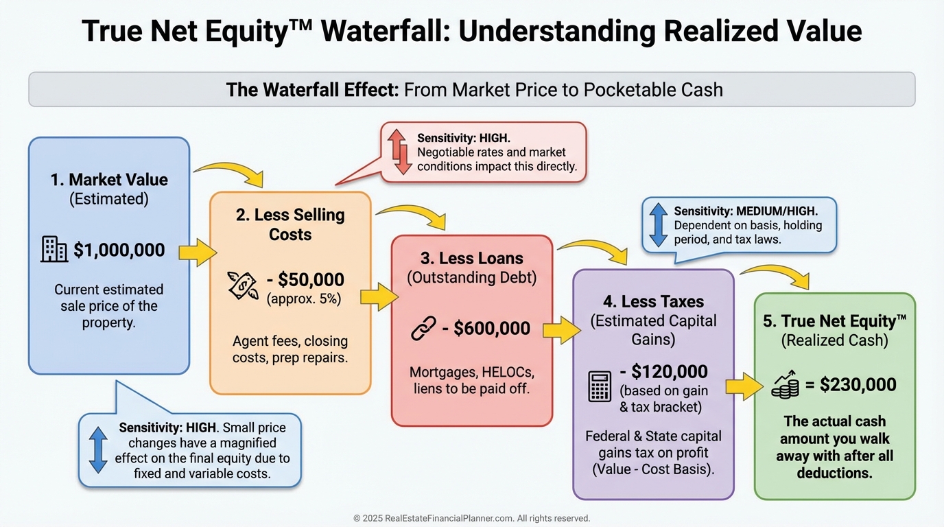
True Net Equity™ at a Glance
Many investors overstate equity and make weak decisions.
I calculate True Net Equity™ by subtracting selling costs, capital gains taxes, depreciation recapture, and payoff balances.
Seeing that waterfall prevents premature 1031s and underfunded sales.
It also clarifies whether a cash-out refi or a sale really advances your plan.
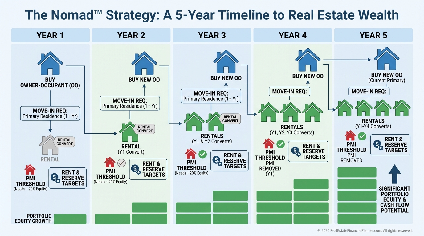
Nomad™ Strategy Made Simple
When I map it visually, clients finally see how five moves in five years can replace a decade of grind.
The timeline shows down payments, PMI drop-off, rent-ups, and reserve milestones.
Confidence follows clarity.
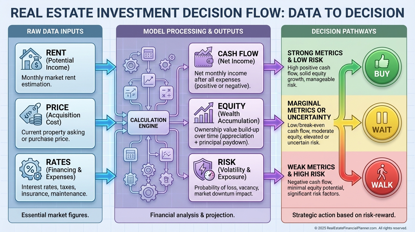
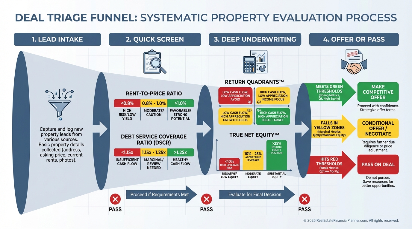
Underwriting with Pictures: The Deal Screen
I model how small changes cascade.
Price up 2%, rates up 0.5%, or rent down $75 can flip a deal from green to yellow.
A visual deal screen filters the noise so you only pursue contracts that survive stress.
That saves time and protects earnest money.
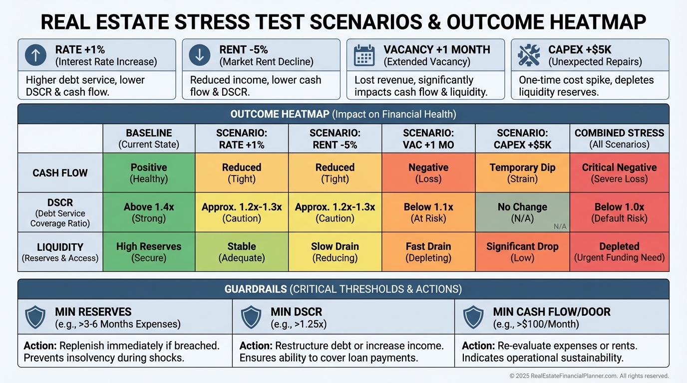
Stress Testing and Risk Guardrails
I warn clients that pro formas lie by omission if they ignore volatility.
We stress test for rate shocks, rent dips, longer vacancies, and capex surprises.
Then we set guardrails for minimum reserves, DSCR, and cash flow per door before adding units.
Seeing the heatmap stops overconfidence in hot markets.
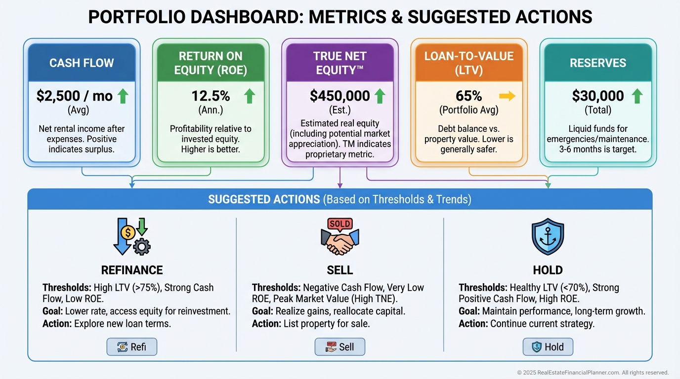
Portfolio Dashboards That Drive Action
Portfolios drift unless you measure the right things.
I track cash flow, Return on Equity, True Net Equity™, and loan-to-value by property.
A dashboard showing trend lines tells you when to refinance, sell, or hold.
It also highlights dead equity that should be redeployed.
Storytelling for Lenders, Partners, and Sellers
Visuals accelerate trust.
Sellers also respond to simple visuals that show why our price is fair and our terms reduce their risk.
Clarity reduces friction and gets signatures.
How I Build Infographics That Teach
First, I write the question the graphic must answer.
Then I strip away everything that does not answer it.
I order the elements to match the decision path, not the data source.
I keep labels plain, colors purposeful, and footnotes specific to assumptions and dates.
Every number traces back to a model I can open and defend live.
What I Model, Check, Avoid, and Warn Clients About
I model best-case, base-case, and worst-case returns with identical assumptions across properties.
I check Return on Equity quarterly because aging equity hides declining performance.
I avoid mixing pro forma and actuals on the same chart without clearly separating them.
I warn clients not to treat appreciation as guaranteed or reserves as optional.
I calculate True Net Equity™ before recommending a refi, sale, or 1031 to ensure transaction friction doesn’t erase the gain.
Common Visual Mistakes That Cost Investors Money
Overloaded charts bury the decision.
Mismatched scales make one risk look tiny and another massive.
No time component hides when cash flow actually turns positive.
Omitting selling costs or taxes inflates equity and leads to weak trades.
Most costly of all, charts with no guardrails invite overleveraging.
Your Next Step
Pick one decision you need to make this week and build a single graphic that answers it.
If you need a starting point, map your Return Quadrants™ and a True Net Equity™ waterfall for your top property.
When your visuals make the decision obvious, you’re ready to act.
And acting on clarity is how portfolios grow on purpose.
Contents
10 Reasons Small Business Should Use Infographics in Their Marketing
10 Reasons Small Business Should Use Infographics in Their Marketing